css 3D
文章
总述
CSS 3D 是个挺好玩的东西,闲暇的时候,可以稍微看看
在开始之前,请先看 Reference -> my reference,那里有入门知识。
CSS 3D 坐标系
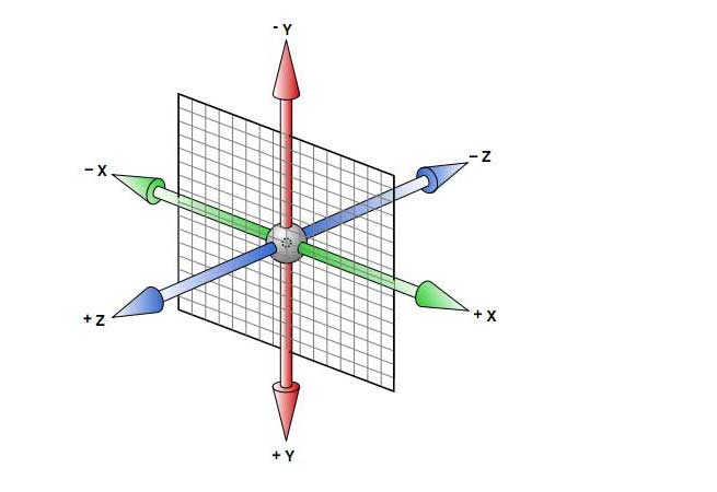
rotateX && rotateY && rotateZ 的旋转方向,都是从每个坐标的正向看过去,顺时针的方向
translateX && translateY && translateZ 的平移方向,都顺着各个坐标的正向
当然,先 rotate 和 先 translate 不一样幺
Tips
use GPU ?
用 CSS 开启硬件加速来提高网站性能? please see Increase Your Site’s Performance with Hardware-Accelerated CSS or Improving HTML5 app performance with GPU accelerated CSS transitions
但是可能会有问题,发现这样做 伪对象 不听使唤了有木有,请看: CSS performance relative to translateZ(0) && a dabblet demo
translateZ percent ?
translateZ 不能使用 百分比,translateX && translateY 可以,为什么呢,标准如此:
- [The percentage] refer[s] to the size of the element's box
- Note that values are not allowed in the translateZ translation-value, and if present will cause the propery value to be invalid.
3D menu
下面两个是比较有意思的实现,第一个比较好想,它就是一个多面体的其中两面,做过正多面体的应该都清楚。第二个,更有意思一点...
手动实践
实例
just click here,关于 css 2D 变换出正多边形,请看前一篇 CSS Regular Pentagon && 2D demo
Reference
my reference
这两篇对理解 CSS 3D 很重要
此栏目下的,以下内容,与文章内容没有关系,只是一时心血来潮,简单的列了一下经常去的网站:
some cool demos(not only 3D):
My favourite is codepen.
or you may be curious about D3
or see examples on github